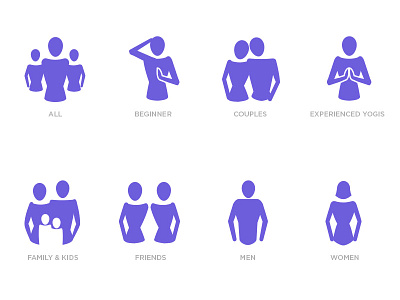
Demographic icons
Part of an extensive set of icons for a yoga and health retreat center
I helped the lead designer on a recent responsive site build for a Yoga and Health retreat resort. I worked with the lead visual designer and the lead ux designer on establishing a visual style for the sites taxonomy for class offerings. The color for all icons is the orange you see in the top of the list, the color code is simply to break up the different icon sets.
The thought behind these icons was to emulate the female form, but keep the structure fairly ambiguous. We want to encourage an open-class environment for people of all-shapes and sizes, but wanted to keep in mind the primary market, women.
More by Matt Nagy View profile
Like
