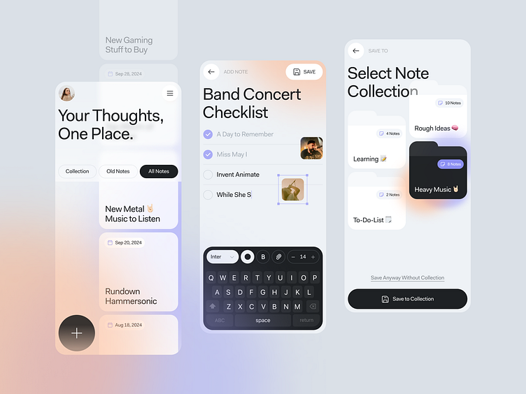
Manote - Notes App
Hi Everyone!
I'm back with a mobile app exploration that is no less cool than the other shots. This time, I tried to create a Notes App concept that is quite clean but futuristic without confusing users to write notes on their smartphones. Introducing Manote.
The UI design of this application uses big typography with a combination of gradient colors on the background. And a few illustrations with dark colors that add a modern and professional impression. The CTA button is made in black so that it is easier to see and the user's focus is not disturbed by other components even though I use a lot of empty space on the screen.
EWe can help your ideas turn to life. Don't hesitate to contact us right now.
More by VanguardCX View profile
Like


