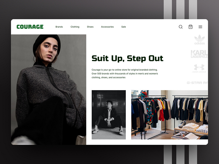
Hero Section for an Online Store
In this concept, I crafted the Hero Section for an online store specializing in original branded clothing. My goal was to showcase my strong skills in composition, hierarchy, and rhythm, resulting in a visually compelling and stylish layout. The design exudes a bold, edgy vibe to resonate with a fashion-forward audience. I chose Russo One for headlines to make a statement and Inter for body text to keep the content clean and readable. Every element, from the logo placement to the call-to-action, was carefully positioned to enhance the flow and balance of the layout. Leave a like and let me know your thoughts in the comments!
🤝 Let’s make ideas happen:
design.by.chernova@gmail.com
More by Kateryna Chernova View profile
Like
