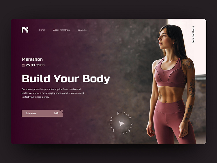
Hero Section for Sport Marathon
This Hero Section concept was created for a landing page promoting an upcoming fitness marathon. The exercise focused on applying core Figma skills, while experimenting with impactful visual hierarchy and unique button design. I selected the bold and stylish Russo One for the headline, paired with Calibri for readability in the main text, giving the design a modern and professional look. The layout combines clear navigation, an attention-grabbing headline, and a prominent CTA button inviting users to join the event. I also added a custom 'Watch Promo Video' button to enhance engagement and create a dynamic first impression. Leave a like and let me know your thoughts in the comments!
🤝 Let’s make ideas happen:
design.by.chernova@gmail.com
More by Kateryna Chernova View profile
Like
