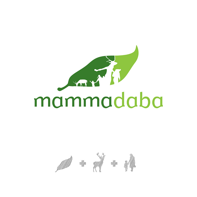
mammadaba logo
Brand:
Latvia's State Forests (LVM) oversee more than half of the country’s forests, prioritizing sustainability, and biodiversity. Through the Mammadaba initiative, meaning 'Mother Nature,' LVM invites people to engage with nature, ensuring forests remain vibrant and accessible for future generations.
Challenge:
The challenge was to make LVM, a serious state entity, feel approachable and relatable to the public. It was essential to communicate that Mother Nature benefits everyone and that LVM is dedicated to preserving sustainable forest ecosystems, which support wildlife and provide crucial resources for human life, ensuring their vitality for future generations.
Solution:
The logo features a tree leaf, incorporating playful imagery of parents and children enjoying nature. This vibrant representation balances the seriousness of LVM’s mission with the warmth and fun of family, illustrating how Mother Nature nurtures both the environment and humanity, making the brand approachable and engaging.
Brand: Mammadaba
Client: Latvijas Valsts Meži (LVM)
Year: 2004
Service Category: Logo, Brand Identity
Designer: Gints Apsīts (Graphic Design, Art Direction)
Agency: ZOOM! / !MOOZ
Creative Director: Ēriks Stendzenieks (Name Author)
