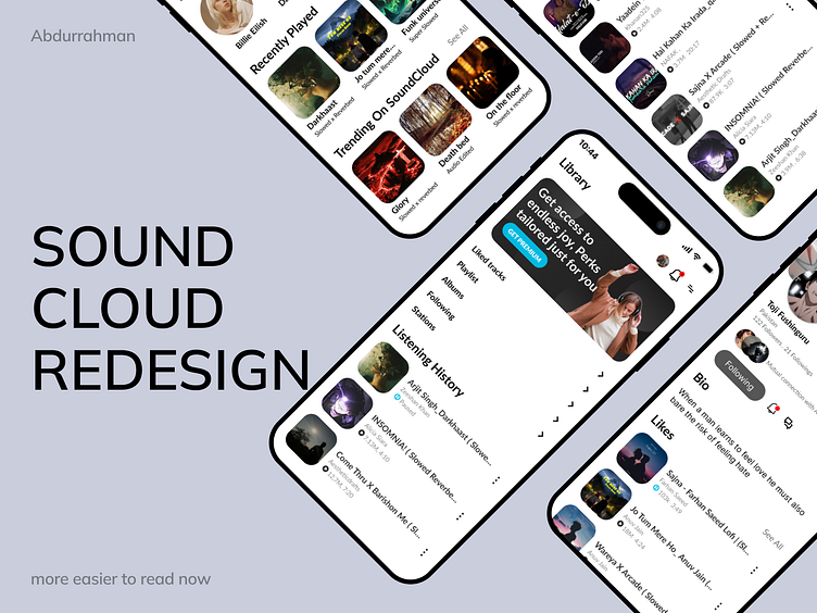
SoundCloud redesign
more clarity added based on user research
For this design 🎨, I’ve chosen a sleek and modern color palette to ensure a clean and interactive UI ✨. The primary color (#FFFFFF) keeps the interface minimalistic and open, allowing for easy readability 📖. The active state color (#00BAE1) brings a vibrant pop of blue 💙, drawing attention to interactive elements and guiding the user clearly. The primary text (#000000) is bold and ensures the content stands out 🖤, while the secondary text (#6E6E6E) is used for less prominent details, establishing a strong visual hierarchy 📊. The border and outline color (#A8A8A8) subtly defines areas without overwhelming the design 🚧.
For typography, I’ve chosen Lato in bold and regular styles 🅰️, giving a modern yet professional feel to the text ✍️. The icons at the bottom represent key features like notifications 🔔, playback controls ⏯️, and settings ⚙️. Each one is designed to be intuitive and visually aligned with the overall aesthetic, ensuring users can easily navigate the app 🚀.
This design focuses on delivering a streamlined and user-friendly experience, with a modern layout and intuitive navigation. The interface is clean and minimal, enhancing usability without sacrificing visual appeal. Icons at the bottom of the screen provide easy access to essential functions like notifications, playback controls, and settings, ensuring users can effortlessly interact with the app. The typography choice of Lato complements the design's simplicity while maintaining a professional and engaging feel. Overall, this design aims to balance aesthetic appeal with a smooth, functional user experience.
HAVE AN APP IDEA ? LETS TALK >
WHATSAPP . 0328 499299
GMAIL . sedits1237@gmail.com


