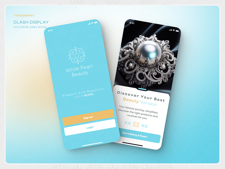
White Pearl Beauty Logo
White Pearl Beauty Logo
Berlin, Germany 🇩🇪.
White Pearl Beauty captures the essence of grace and sophistication, echoing the timeless allure of a pearl 🌸. This brand embodies beauty, delicacy, and refined charm in every detail.
Dark and Light Mode Compatibility
The White Pearl Beauty logo is crafted to shine in both dark and light modes, with carefully balanced contrast that maintains its elegance and harmony across all backgrounds ✨.
Color Design and Contrast for Brand Personality
Soft sky blue, cream, and light brown tones were selected to reflect the purity and sophistication of a pearl 🐚. These colors evoke calm and elegance, aligning perfectly with the brand’s luxurious personality.
Branding for Social Media Presence
The branding approach focuses on minimalism and exclusivity, with every detail of White Pearl Beauty’s logo designed to exude a refined touch. Perfect for digital platforms, its clean, iconic style stands out and captures the brand’s luxurious vibe.
Geometry in Logo Design
The circular design is inspired by the spherical beauty of a pearl, symbolizing completeness and timelessness. This rounded form adds a sense of harmony and unity to the brand.
The White Pearl Beauty logo merges elegance and functionality, adaptable across products and platforms. From packaging to online presence, the logo’s versatile design enhances the brand identity, creating a seamless and memorable experience wherever it appears.


