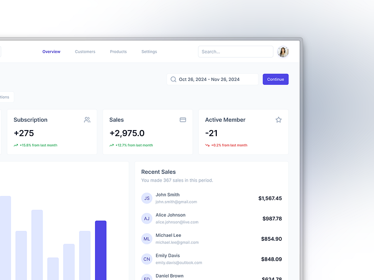
Sales Dashboard UI - Light Mode
Hey Everyone!
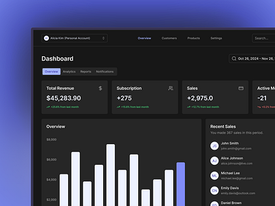
Switching it up with a light mode version of my previous sales dashboard design! Built with shadcn/ui components, this layout brings a fresh, clean look that keeps the focus on performance metrics while enhancing readability in bright settings. Designed to offer the same seamless experience as the dark theme, now in a light and airy style.
Which mode do you prefer: light or dark?
Have any web or app ideas in mind? Let's collaborate to visualize it!
Drop an email here:
Or use any freelance platform:
More by Dony Alhadi View profile
Like


