Noor Noir - Logo Redesign
Noor Noir - Logo Redesign
Branding & Identity
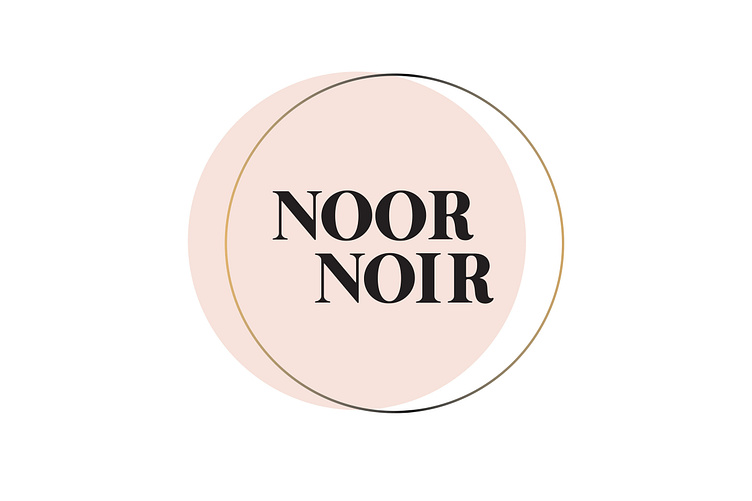
The redesign of Noor Noir's logo was the first step in what would become an entirely new brand identity. The new logo enhances brand recognition and better represents the essence of the company, as a uniquely feminine and elegant line.
Client
Noor Noir is a jewelry company inspired by the hidden treasures of the sea. The collection incorporates natural materials such as pearls, aquamarines and seashells, into every item of jewelry. The name Noor Noir means Light (Arabic) and Dark or Black (French), relating to themes of nature, transience and impermanence.
Project
The client felt her original logo (designer unknown) was not working in two main ways - the shape was not conducive to different applications, and, more importantly, that it did not accurately represent the high-end, handcrafted jewelry being sold.
Design
From the original logo, I wanted to maintain the waxing and waning moon symbols that signify the juxtaposition of light and dark and reference the changing natural elements used in the collections. I chose an elegant, simple font, stacked to create a symmetrical design that would fit different placements. I was drawn to the idea of simple circles intersecting and creating crescent moons, hinting at movement and seeing only a fraction of the whole.


