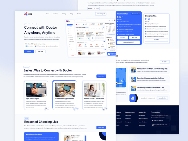
Telehealth SaaS Landing Page
A well-designed telehealth SaaS landing page is critical for converting visitors into users and establishing trust with potential patients and healthcare providers. Here’s why effective landing page design is essential in the telehealth space:
✅ 1. Instantly Establishes Trust and Credibility
In healthcare, trust is everything. A well-structured and visually appealing landing page that highlights secure messaging, qualified doctors, and privacy policies reassures users that their data and health concerns are safe.
✅ 2. Clear and Intuitive Navigation
Telehealth platforms are often used by individuals who may not be tech-savvy. Easy navigation, such as clear call-to-action buttons for booking appointments or signing up, ensures that users can find what they need without frustration, enhancing user experience and reducing drop-off rates.
✅ 3. Showcasing Key Features
A telehealth SaaS landing page should highlight critical features like virtual appointments, patient portals, and secure messaging. This helps visitors quickly understand the platform’s value, making them more likely to explore and engage with the service.
✅ 4. Highlighting Benefits and Ease of Use
Illustrating the steps to connect with a doctor, as seen in the image, demonstrates how easy it is to get started. Breaking down the process into clear steps reduces anxiety and encourages users to take action.
✅ 5. Effective Use of Social Proof
User testimonials, ratings, and partner logos build social proof, showing potential users that the service is trusted by others. Highlighting positive feedback from other patients or healthcare organizations reinforces the platform's reliability and quality.
✅ 6. Transparent Pricing Plans
Displaying different pricing plans with clear details allows users to easily understand their options. This is particularly important for SaaS as it avoids confusion, helps with decision-making, and can even increase conversions by providing tailored options for various budgets.
✅ 7. Encourages Education and Engagement
A section dedicated to educational content, like FAQs, health tips, and technology updates, positions the brand as a knowledgeable authority in telehealth. It also provides additional value, keeping users engaged and coming back to the platform.
✅ 8. Seamless Contact Options
The inclusion of easy-to-find contact information and customer support options helps ensure that users can get help whenever they need it. This increases user confidence in the service, as they know assistance is available if they have any issues.
A thoughtfully designed telehealth SaaS landing page creates a positive first impression, educates users, and encourages conversions by combining aesthetic appeal with clear information and easy navigation. For telehealth platforms, these elements are essential for building trust, demonstrating value, and ensuring a seamless user experience in a highly competitive industry.
#Telehealth #DigitalHealth #Telemedicine #HealthcareInnovation #VirtualCare #HealthTech #RemotePatientMonitoring #EHealth #MHealth #OnlineDoctor #HealthcareTechnology #ConnectedHealth #TelemedicineSolutions #DigitalTherapeutics #RemoteCare #VirtualHealth #Telecare #TelemedicineApp #HealthIT #MedicalApp
Services love to provide:
✅ Landing Page UX UI Design
✅ Website UX UI Design
✅ Mobile App UI UX Design
✅ SaaS Web Application UI UX Design
✅ Dashboard Web App UI UX Design
✅ WordPress, Woo Commerce Plugin UI UX Design
Let's talk about your project: 👋
abdulkhaleque.design@gmail.com
Facebook - Instagram - LinkedIn - Behance - Dribbble - YouTube - Blog- Telegram


