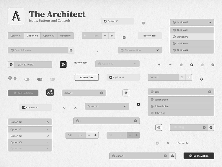
The Architect / Icons, Buttons and Controls
Continuation of the presentation of The Architect MVP Design System for high-fidelity wireframing.
Icons
Since the system is all about wireframing, I only made [and use] the icons that are necessary. For any other situations there is a placeholder icon, which has 2 variants whether you need an ineractable one or not. Also I made a highly flexible and versatile component to show any possible images on the frames called "Piece of Art", which I'll break down at the end.
Buttons
There are pretty much simple buttons with all the states you might need for wireframing, which I think are the default one and disabled. Each button component has 4 variants: text only, with icon on the left, with icon on the right and icon only.
They all have a height of 48px. I use it as a default for major part of the elements. But there's also a 42px alternative, if you might want to fit it somewhere special without drawing too much attention, like "Sign In" button in navigation panel or else.
As a 2nd shot for the buttons, I added an inside the Figma view, with primary and secondary options. Here you can see how these components (and actually any future components I present) are systematized, and some notes of usage for them.
Controls
Controls components are logically separated on Input Controls and Selection Controls. There are not much of them at the moment, but I'm sure there's more to come.
Some components have different variants to choose from when you're designing a wireframe. They're indicated in brackets near the title.
Search
At the moment there's only one option of the search component, which I called "Basic Search Bar". In my mind it is mostly used for quick searching of users, items or something that supposed to have only one thin row of information. However, for any other cases I also added an alternative (variant called "with button") that's supposed to show search results on a separate page.
Piece of Art Component
Here's an idea. I wanted to made an absolutely versatile component, that I can use as a placeholder for any image, whether it is a photo, picture, background or anything else related. And imo I achieved some sort of a success right here.
Why do I think that? Well, the Piece of Art component proved to be flexible, since you can use it starting from even a 24x24 px size and up to 1440x960 px. And actually it is still looking recognizable and fine. Although, it is arguable for 24x24 px size, but 32x32 looking great. Check it yourself below.
Coming Next
Live examples of the design system usage.


