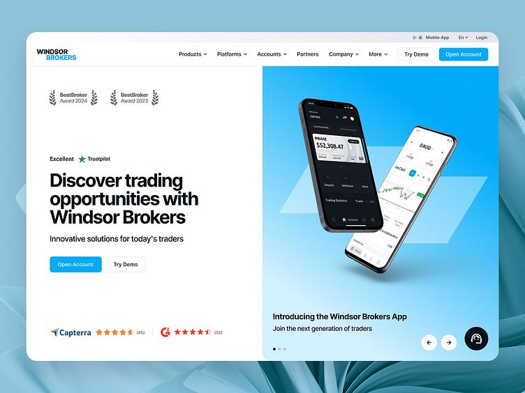
Windsor Brokers hero section concept
Enter your text here...🎉 Hey hey, peeps! Our third shot from redefined series is here! I’m excited to share what we did for Windsor Brokers this time.
For the redesign, we revamped the hero section to improve the site’s navigation and make it easier to use. Instead of hiding the menu, we made it more visible and informative.
We also split the hero section into two parts: one side is used to highlight the company's USP, achievements, and calls to action, while the other side focuses on showcasing products and offers through an attractive slider.
What are your thoughts on this redesign?
More by Alexander Olssen View profile
Like
