Rewardio – Mobile App Concept for Gamified Rewards
About
I’d like to introduce my new design concept for a mobile app called Rewardio, developed to explore a gamified rewards experience. This project emerged after I moved to Germany, where I noticed the increasing popularity of game apps that enable users to earn money through mobile play. My research revealed that many of these apps feature outdated, user-unfriendly interfaces that can confuse users. Some design choices lack logical flow, and the interfaces are often cluttered with unnecessary elements, distracting users from the app's main purpose. This is particularly concerning given the significant potential these apps have for user engagement and revenue generation.
Problem statements
During my research, I analyzed apps like KashKick, TesterUp, Freecash, Cash Giraffe, Mistplay, and others. While these apps share similar features and goals, they also display differences and issues that can impact user attraction and retention.
I focused on key user problems that are common among these platforms, particularly regarding user engagement. Here are two main challenges identified:
1. User-unfriendly interface. Many users sign up but do not proceed to install or play their first game. This drop-off between registration and game installation leads to missed revenue opportunities, as these users do not become active players.
2. Limited variety and poor display of games. The main screen often offers a limited selection of games and lacks effective display methods, negatively impacting user attraction and engagement. Current ranking systems may conceal a broader range of games from view.
While there are various issues affecting user engagement across these platforms, I propose focusing on these two main problems, as they directly contribute to the high churn rate from sign-up to game installation. By addressing these challenges, the apps can significantly improve user retention and overall success.
Sign up
First, I simplified the user registration process by eliminating unnecessary information that could distract users. I also incorporated vibrant app icons representing different games to showcase the variety available right from the user's initial interaction with the app.
Survey
After signing up, users complete a brief survey to help the app understand their gaming preferences. This enables the app to recommend games that align with their tastes, ensuring a personalized experience from the very start.
Dashboard & Rewards
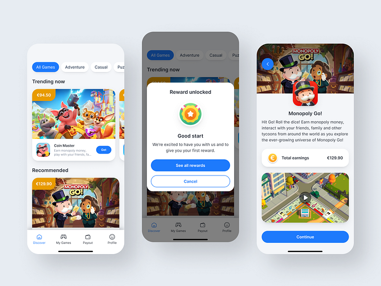
Next is one of the key pages – the “Dashboard”, which serves as the app's main screen. Here, users can explore game categories, view trending games, and discover recommendations based on their survey responses. The design was revamped to showcase multiple offers simultaneously, rather than just the top games. The “Trending now” section features a smooth carousel of high-revenue games, while the “Recommended” section displays game cards tailored to user preferences gathered from the onboarding survey.
To enhance user engagement, I introduced a reward system that allows users to earn rewards for completing tasks, starting with their first reward just for signing up. This adds an element of fun to the app and encourages users to continue exploring.
Game page
Before installing and starting the game, users can review important details such as the game description, total earnings, and an introductory video. If they are interested, they can click the “Continue” button to access the installation guide and rules. The “Game guide” is designed for easy navigation, with information presented in simple steps and visual elements like icons to help users understand how to install the game correctly.
My games
On the “My games” page, users can track their progress. They can view their total earnings and the games they are currently playing. Each game card displays the game icon, name, a brief description, earnings, and the current stage of progress. If users wish to check a full list of challenges, they can click on the card for more details. To complete their offer early, users can click the “Complete offer” button. A pop-up will prompt them to confirm their choice, ensuring they do not click it accidentally.
Payout
Additionally, I redesigned the "Payout" page as a dedicated section. Since Rewardio’s primary goal is to help users earn money, having a separate page in the menu for tracking balances and withdrawing funds is essential. This page features two main states: in the first state, users can view their total balance across all games but are unable to withdraw funds. In the second state, once they reach a minimum of €70, they can initiate a withdrawal from their balance.
Conclusion
The design of Rewardio addresses key usability issues commonly found in many popular game apps that offer users opportunities to earn money but often feature user-unfriendly interfaces. These issues can lead to high drop-off rates from sign-up to game installation. By simplifying the registration process, introducing a personalized survey, and enhancing the dashboard layout, Rewardio boosts user engagement from the outset. The redesign also enables a wider variety of game options to be displayed, making it easier for users to explore and enjoy games tailored to their preferences.
Additionally, the reward system motivates users by offering incentives for completing challenges, starting with an initial reward upon sign-up. The app allows for easy tracking of game progress and earnings, while the redesigned payout page provides a straightforward process for withdrawing funds.
Overall, the revamped Rewardio experience reduces user friction, enhances engagement, and creates a more enjoyable and rewarding environment for users.
Design system
Thank you 💖
I appreciate your time to check out my Dribbble page! If you have any thoughts or comments, feel free to share them.


