The Ordinary
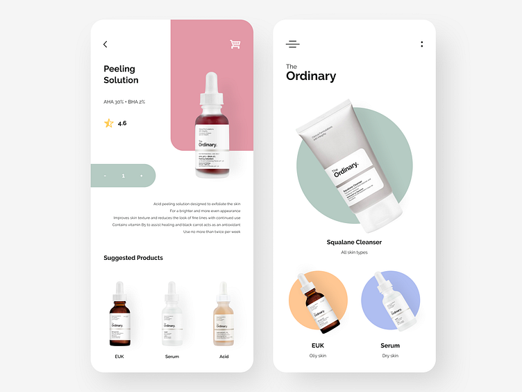
I created an app for my favorite cosmetics brand! The minimalist packaging of their products often looks very similar on store shelves and in online listings. That's why it's crucial to clearly label each product, use color to distinguish them, and include a rating.
This design makes it easier for customers making repeat purchases, allowing them to quickly identify what they need just by the color. While too much text can be overwhelming, it's essential to provide enough detail when it comes to skincare.
Tolls used: Figma
More by Cyndi Castor View profile
Like
