How I create data tables - Explanation
**Anatomy
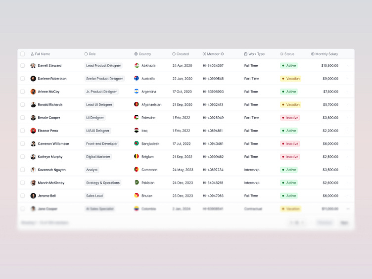
A data table usually contains a header row, columns, and cells. On the top sits the header row, where each column has its header title.
**States
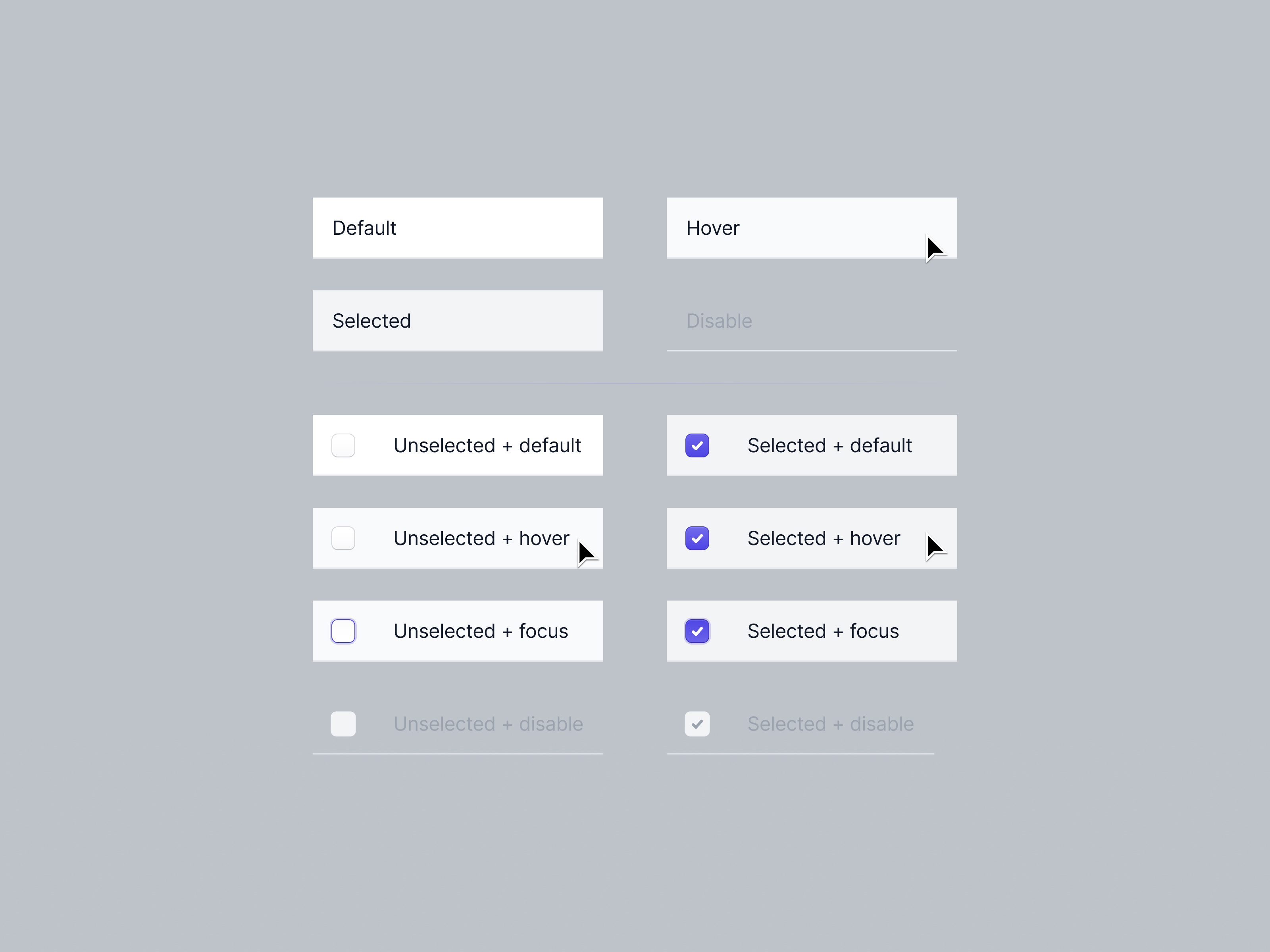
Default:
Appearance: The default state is the baseline appearance of table elements before any interaction. It should be clear, neutral, and easy to read, providing users with a straightforward view of the data
Purpose: Indicates that the element is interactive and can be clicked.
Hover:
Appearance: Changes in appearance when you move the mouse over an element (like a row or checkbox)
Purpose: The hover state helps users understand that an element is interactive and can be clicked or selected. It enhances the discoverability of actions within the table.
Focus:
Appearance: A visual change when an element is selected by clicking
Purpose: Helps users, especially those navigating with a mouse click, easily identify the currently active element
Selected:
Appearance: Highlights an element when it’s chosen, like a different color or checkmark
Purpose: Shows users what they’ve selected, especially useful for actions involving multiple items.
Disable:
Appearance: Disabled elements appear faded or grayed out to indicate that they are not available for interaction. They do not respond to clicks or hovers
Purpose: Clearly shows users that these options or actions are not available.
**Components naming
Naming your components with clear, descriptive names isn’t just a good habit—it’s essential for a smooth, efficient, and collaborative design process, especially in complex projects where multiple designers and developers might be involved. Think of it as setting up a well-organized toolbox where every tool has its place. When you need something, you know exactly where to find it.
Bad component names: "Frame 1618873 - What is this even for?" 😡
Good component names: "Oh, there it is!" 😊
Note: Unnamed components are like trying to find your keys in a dark room. Named components are like having a labeled key rack—easy, organized, and stress-free.
**Spacing
A grid keeps everything aligned, making your table look clean and organized. Consistent spacing between rows and columns ensures the table is easy to read.
Thoughtful spacing makes tables easier to use, especially for people with visual or cognitive impairments.
**Cells Density
Condensed:
Use Case: Ideal for users who need to view a lot of data at once, especially in data-heavy applications like dashboards or monitoring tools.
Considerations: It can make the data harder to read, so it's best for users who are familiar with the content and need to see more at once.
Normal (default):
Use Case: A balanced option that works well in most scenarios. It maintains readability while still displaying a good amount of information.
Considerations: It provides enough spacing to prevent clutter, making it a reliable option for general use or common use.
Spacious:
Use Case: Best for tables with complex or dense data where readability is paramount. It’s also useful for users who may have difficulty reading smaller text or those who need to focus on individual data points.
Considerations: While it enhances readability, it also takes up more space, so it's suited for scenarios where clarity is more important than fitting a lot of data on the screen
**Text alignment
Left (default):
Aligning non-numeric text to the left allows for easier reading, as it matches the natural reading flow in left-to-right languages.
Right:
Right-aligning numeric data is standard practice for readability and ease of comparison, especially for financial figures and calculated values like percentages. This method is recommended in data visualization literature, such as Edward Tufte’s work on data presentation.
Note: The exceptions listed (phone numbers, dates, postal codes, and identification numbers) are treated as textual data rather than numerical values, so left alignment is appropriate. These data types are not meant for arithmetic operations or direct comparison, so aligning them like text helps maintain consistency in reading patterns.
**Bulk action
Allow users to select and update multiple items at a time. Once the rows are selected, common actions are made available at the bottom of the table. This feature can save users a lot of time by batching together repetitive tasks
If you're looking for a design partner for your next SaaS project, contact us, and we can discuss how we can help you achieve your goals.
📬 We're available for new projects. Contact us at hi.wecrafts@gmail.com


