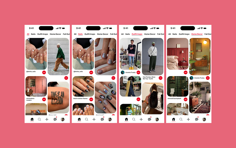
Pinterest Redesign Exploration
Pinterest is one of my favorite apps!!
I decided to explore new ways to improve the tab options and also make the ellipses more prominent.
To increase visibility, show a clearer active state, and keep up with brand consistency, I added red to the tab options in an active state and red around the ellipses. This would make it easier for users to quickly spot the different sections and navigate faster eliminating any confusion.
If you're in need of a project, send over an email!
createwithsamm@gmail.com
More by Samira Alston View profile
Like
