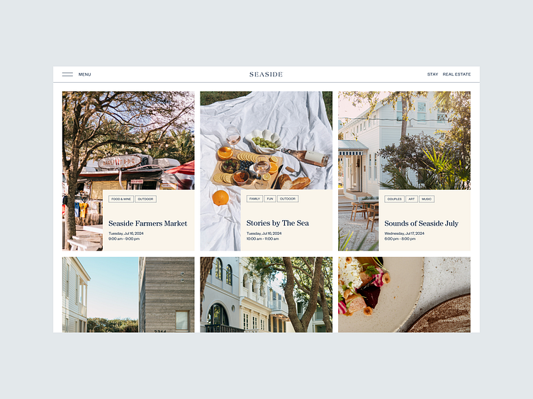
Happenings Page Three Column Grid with Rich Imagery
This design unfolds like a gallery of experiences, where each event feels like a small window into the world of Seaside. Using a clean grid layout, it brings the vibrant life of the town to the forefront, making each event visually engaging and easy to explore. The large, inviting images do most of the talking, while small, elegant text blocks provide just enough information to spark curiosity.
See the full case here
More by Anastasiia Panova Petukh View profile
Like
