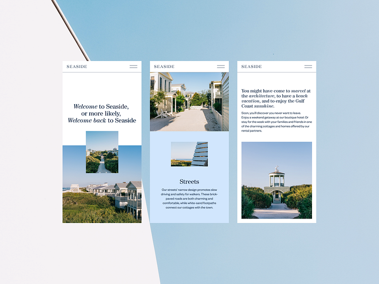
Responsive Three-Column Mobile Layout with Centered Imagery
This design turns your mobile screen into a window, offering a calm and effortless journey through Seaside. Each section feels like a personal invitation, gently guiding you with soft visuals and welcoming text. The layout flows naturally—centered images anchor your attention while the clean, spacious design gives everything room to breathe.
See the full case here
More by Anastasiia Panova Petukh View profile
Like
