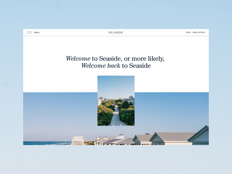
Responsive Hero Layout with Centered Visuals
This design whispers an invitation, where the simplicity of space draws you in, and the words seem to float effortlessly on the screen. The centered message feels like a gentle greeting—personal, familiar, almost as if it's been waiting for you all along. Below, a serene image opens up like a doorway, pulling you deeper into the heart of Seaside, where tranquility and warmth converge.
The design breathes with intention, the vast whitespace creating moments of pause, where content is allowed to resonate. The navigation, subtle and unobtrusive, lets the design's calm presence take the lead, ensuring that every interaction feels effortless. With its soft tones and balanced structure, this layout is more than a webpage—it’s an invitation to slow down, to connect, and to feel at home.
See full case here
