Alonso Baldez - Logo Concept Exploration
Alonso Baldez Consultoria - Logo Concept Exploration
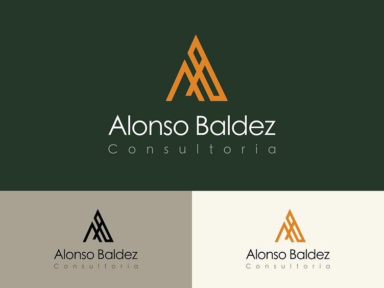
The "Alonso Baldez Consultoria" logo features a minimalist design that combines the letters A and B, the company's initials, into a triangular symbol. The idea behind this concept was to integrate the brand's identity directly into the logo while also reflecting the consultancy's core values and reinforcing its name.
Concept and Meaning:
The triangle-like symbol at the top using the A and B letters symbolise stability and growth, which are key elements of consultancy work. Its sharp angles suggest precision, strategy, and a forward-thinking mindset.
The orange color used in the symbol evokes energy, creativity, and success, aligning with the firm’s goal to energise and guide businesses towards successful outcomes.
The dark green background represents knowledge, wisdom, and growth, key attributes for any consultancy firm. It contrasts nicely with the orange symbol, making it stand out and creating a sense of balance.
Typography:
The Alonso Baldez text in a modern, clean font, indicates professionalism and clarity. The "Consultoria" in a lighter tone is to add an elegant touch and keep the focus on the company name, while suggesting transparency and expertise.
This logo tells the story of a consulting firm that combines deep insight (green) with dynamic, forward-thinking strategies (orange), all while maintaining a sharp, professional approach to problem-solving and growth.
Please share your feedback! ____
Do you need some help? Feel free to reach out!
