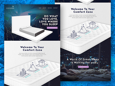
Website + branding Concept Direction
This a concept/branding direction for secret client project, hence the blurred logo. So, while it wasn't a fully fleshed out design for their site it was an experiment in visualizing the brand direction we concepted in a space they would actually use it.
More by Kevin Cash View profile
Like
