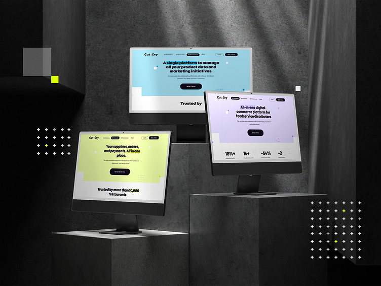
Cut+Dry [ Website ]
Serving up innovation: Cut+Dry's digital transformation! 🍉
We crafted an interactive and visually appealing website for Cut+Dry—a revolutionary platform transforming the food industry into a more enjoyable, profitable, and sustainable space.
Our design and development team brought Cut+Dry's mission to life through carefully chosen animations and a bold aesthetic, making the website both informative and memorable. Built on WordPress, the site is easy for the team to manage and keeps content fresh and engaging.
A dynamic color palette featuring bright yellow, soft lavender, deep blue, and balanced greyscale tones brings warmth and energy to the platform’s look. Mont was chosen for headers to deliver a bold, modern touch, while Lato complements the site with clear readability in body text, enhancing user experience across longer content.
Energize your digital presence with Cut+Dry's innovative vibe! 🍉
Let's get started on your project today! Drop us a line: hello@3angle.pro
We also encourage everyone to support Ukraine💛💙 with links below or any way you can!


