UX/UI design of desktop app: Peerio
At Peerio, I had the opportunity to dive into a multi-faceted role that spanned UX/UI design and UX research for both mobile and desktop platforms. Working closely with two other product designers, we each brought unique perspectives to the table, allowing us to seamlessly collaborate and build on each other's strengths. We started each project with brainstorming sessions and flow mapping on the whiteboard, which laid the groundwork for our individual tasks while maintaining a unified vision.
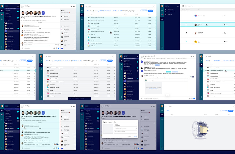
In this showcase, I’m highlighting my work on Peerio’s storage and file management system. This project involved designing intuitive workflows for uploading, sharing, and organizing files. My goal was to create an experience that felt natural, powerful, and efficient, making it easy for users to manage their files across devices with confidence.
Uploading and organizing files impacted two core features: Files and Chat. These features, showcased in the mockups below, were designed to work seamlessly together, allowing users to effortlessly share and manage content within conversations and storage spaces.
To achieve this, I developed several new components with a strong focus on usability and clear state indicators. Since uploading and sharing files can take time, I prioritized visual feedback to keep users informed throughout the process. Additionally, it was essential to design safeguards that minimized the risk of accidental file sharing, helping users avoid sending sensitive information to the wrong contacts.
ABOUT
Date: 2017-2018
Environment: Agile
Design team: design manager, 3 product designers (one of which was me), 1 graphic designer
My role: UX/UI design, workshop facilitation, UX research for desktop version of the feature
Status: The product was integrated to WorkJam app, it is not available to public anymore
Company: Peerio
kh.uxer@gmail.com
get in touch


