SHAKE THAT CHICK | LOGO DESIGN & BRAND IDENTITY
Fast food brand Shake That Chick was born with the mission of bringing customers delicious, attractive crispy chicken pieces. Each piece of chicken is not only a dish but also a unique flavor experience, helping customers fully enjoy the joy and satisfaction.
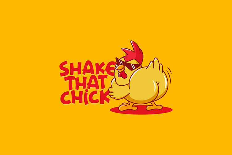
The Shake That Chick brand identity designed by Bee Art uses two main colors, red and yellow, to create a youthful, dynamic and easily recognizable image. Red represents enthusiasm and passion, and also helps stimulate appetite, while yellow evokes a feeling of joy, warmth and friendliness. The combination of these two colors not only highlights the brand image but also creates a sense of closeness, joy and attracts all eyes.
The logo is designed as a chibi image of a chicken wearing sunglasses with a confident demeanor combined with a solid sans serif font, arranged irregularly to show the flexibility, fun and friendliness of the brand. At the same time, the image of the chicken also represents the brand's main business product. Overall, it creates a creative, impressive and customer-attracting logo.
-
Client Shake that chick
Logo Design Project. Logo is designed for Fried Chicken shop.
Copyright© Bee Art. All Right Reserved
Contact us:
• Hotline/ Zalo: (+84) 77 34567 18
• Email: info@beeart.vn
• Website: www.beeart.vn
• Facebook: https://www.facebook.com/BeeArt.vn


