LoadLoad - Branding Guidelines
Overview
LoadLoad is a modern logistics and transportation service brand, focusing on providing users with an easy and reliable way to move items. Its visual identity, typography, and overall design language reinforce the brand’s commitment to simplicity, professionalism, and efficiency. These guidelines will help maintain brand consistency across various touchpoints.
Logo
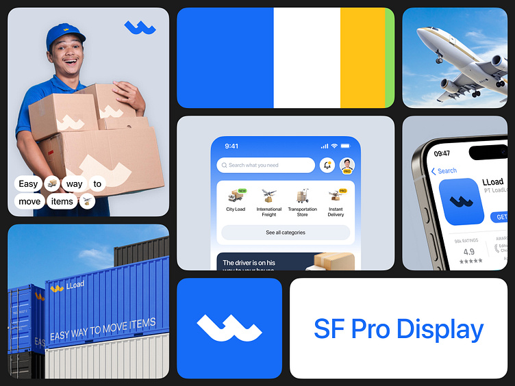
Primary Logo: The logo consists of a wave-like design element, symbolizing movement and flow, with the brand name "LLoad" placed in a clean, modern typeface. The wave imagery suggests ease of transport, reliability, and continuous service.
Usage: The logo should always be used in its primary color (blue or white) for optimal visibility. Avoid distorting, recoloring, or resizing the logo disproportionately.
Color Palette
The color palette reflects the core values of trust, energy, and professionalism. These colors are used consistently across digital and physical platforms to maintain brand identity.
Primary Colors:
Blue (#1877F2): Symbolizes trust, security, and reliability. Used predominantly in the app, branding materials, and employee uniforms.
Yellow (#FFD700): Represents energy and action. This color is used for accents, such as highlighting important features or calls to action.
Green (#32CD32): Conveys growth, progress, and eco-friendliness. This is an accent color used to emphasize sustainability or environmental initiatives.
White (#FFFFFF): For clear, clean, and modern backgrounds that help the core elements stand out.
Typography
Primary Typeface: SF Pro Display is the official typeface of the LLoad brand. This sans-serif typeface is modern, clean, and highly readable across all screen sizes. It enhances the brand's professional and sleek look.
Usage: SF Pro Display should be used for both headers and body text to ensure uniformity in communication materials. Emphasis can be achieved through bold weights for headings and light weights for body content.
Imagery
Visual Style: LLoad’s imagery focuses on clean, modern visuals that reflect professionalism and reliability. Photos of employees, vehicles, shipping containers, and logistics-related activities should have natural lighting, with a friendly, approachable tone.
Key Visuals: The brand emphasizes visuals of transportation (e.g., planes, containers, and trucks) and satisfied employees and customers. This builds trust and highlights the company’s human-centric approach.
Icons & Graphics
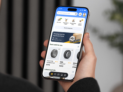
Iconography: LLoad uses minimalistic icons to represent its services such as City Load, International Freight, Instant Delivery, and Transportation Store. The icons are clean, consistent with the brand’s aesthetic, and designed to be instantly recognizable.
Icons Usage: Use icons with the brand’s primary colors (blue and white) to maintain visual harmony. Avoid overly complicated or detailed graphics.
Tone & Messaging
Tagline: "Easy Way to Move Items" – This slogan captures the core mission of the brand, focusing on simplicity and efficiency in logistics.
Voice: The brand’s tone of voice is friendly, professional, and customer-centric. All communication should be clear and direct, instilling confidence in users about the services provided.
Applications
Mobile App: The app’s design reflects LLoad’s clean and modern aesthetic. Blue dominates the interface, ensuring brand consistency. Calls to action, like “Get Pro,” stand out with yellow highlights, drawing user attention to key services.
Packaging: LLoad’s boxes and containers feature the logo and tagline prominently in blue with white or yellow accents. Packaging is designed to be instantly recognizable while promoting professionalism.
Uniforms: Employee uniforms, seen in logistics workers like delivery personnel, use the primary blue color, featuring the logo prominently on caps and shirts.
Brand Personality
Approachable: LLoad makes moving items simple and hassle-free for customers.
Professional: With clean designs and a focus on efficiency, the brand exudes professionalism.
Reliable: Consistency in the logo, colors, and typography reinforces the trust and dependability of LLoad’s services.
Let's collaborate with us
🛍️ Download our Premium UI Kit on
Follow our pages and join the journey
Instagram | LinkedIn | Behance

