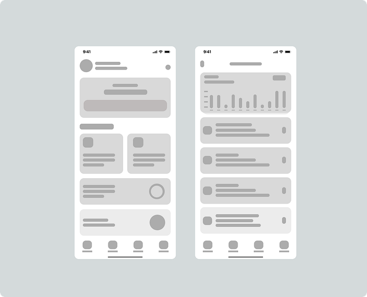
Replication of the Wisely mobile app
I recreated the wirefrsme and the dark mode of the Wisley mobile app interface as part of my design practice. The focus was on enhancing usability while maintaining a clean and modern aesthetic. I streamlined the navigation and improved the visual hierarchy for a more intuitive user experience.
Changes:
- Simplified navigation for better accessibility
- Refined typography and spacing for improved readability
- Updated color palette to create a more cohesive look
Feedback is welcomed!
More by Hakeem View profile
Like

