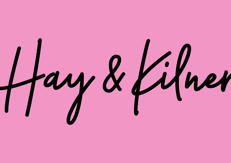
Hay & Kilner Logotype
Repositioning and realigning a leading North East law firm
Hay & Kilner, a distinguished law firm, sought our consultancy to revitalise their brand and digital presence to match their progress and culture.
We crafted a brand strategy and identity to reflect their experienced, dynamic team and people first approach. A core theme throughout the strategy development was capturing their approachability and empathetic attitude to business, personal and family law.
The visual identity was designed to embody their brand purpose and engage people with their genuinely refreshing approach to law. A personal, empathetic approach built on human relationships, something often missing in the legal sector.
Instantly recognisable with the hand drawn wordmark and prominent use of their head turning pastel pink, the identity balances a professional, yet refreshing aesthetic. The rebrand helped elevate Hay & Kilner's market position and realigned their team as they moved their HQ to an impressive new base in the Lumen building in the heart of Newcastle.
Learn more in the full case study at Studio Inter
