Tactic Logo Design
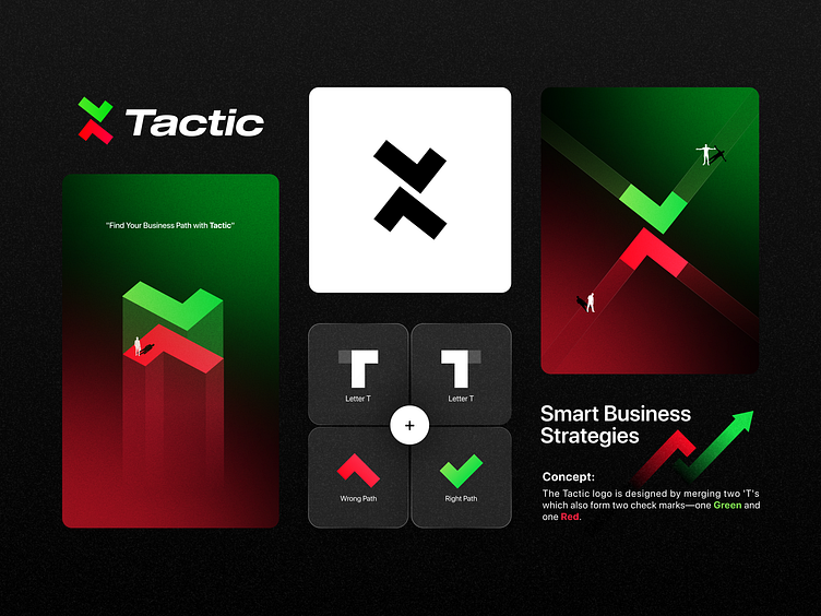
Logo Design for Tactic Company."Find Your Business Path with Tactic".
"The Tactic logo is designed by merging two 'T's, which also form two check marks—one green and one red. The upward-pointing green check mark symbolizes the 'right path' in business strategy, representing growth and success. In contrast, the downward-pointing red check mark illustrates the 'wrong path,' indicating potential pitfalls or failures. Both paths are crucial: to navigate towards the right path, one must be aware of the wrong one. Together, they emphasize the balance and awareness needed for strategic decision-making."
More by Sina Amiri View profile
Like


