Medical Website
💌 Have a website idea? Let's bring it to life together!
Hi everyone! We're pleased to present our latest design concept for a cosmetic clinic's website. Let's explore its design features.
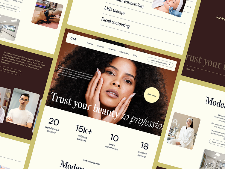
The main screen features several key sections to provide users with a comprehensive overview of the clinic. There's a statistics block designed to showcase the clinic's expertise, a section highlighting the advanced technologies they use, a block introducing the specialists, and an overview of the available services. The footer includes a booking form to facilitate easy appointment scheduling.
The color palette consists of warm tones to create a softer and more welcoming appearance for the site. Additionally, a combination of serif and italic fonts is used to add a touch of elegance, balancing friendliness with sophistication.
A key feature of this design is its structured layout, which enables users to easily navigate through the clinic's offerings and connect with specialists, enhancing their overall experience.


