E-Commerce Mobile App
💌 Have a mobile app idea? We are available for new projects!
Hi everyone! Our team recently completed a design concept for a mobile marketplace app. Let's explore its design features.
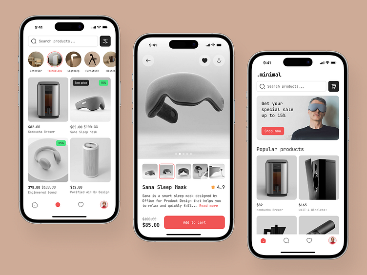
The catalog screen features a search bar with filters and product categories at the top, with product cards displayed below. Each card highlights a product image, name, rating, and description, with the price and add-to-cart button at the bottom. The main screen includes the store's logo, a search bar with a cart button, a promotional banner, and popular product selections.
The black-and-white theme works harmoniously with minimalist product photos on a light gray background. Bright colors are used to highlight buttons and discounts, making them stand out effectively.
A key feature of this design is the intuitive layout that enhances user navigation, ensuring that customers can easily find and purchase products with minimal effort.


