Information Architecture #11 to #15 - 30 days challenge
#11 - #15 : Information Architecture - 30 days challenge @Hype4Academy
Hello all 👋🏻,
Back again with another update on my IA challenge journey with Hype4 Academy! This week, we went beyond websites and apps to tackle the IA of things we use every day.
Let me tell you, it's made me super aware of the hidden design choices around us!
Here's a sneak peek at days 11-15:
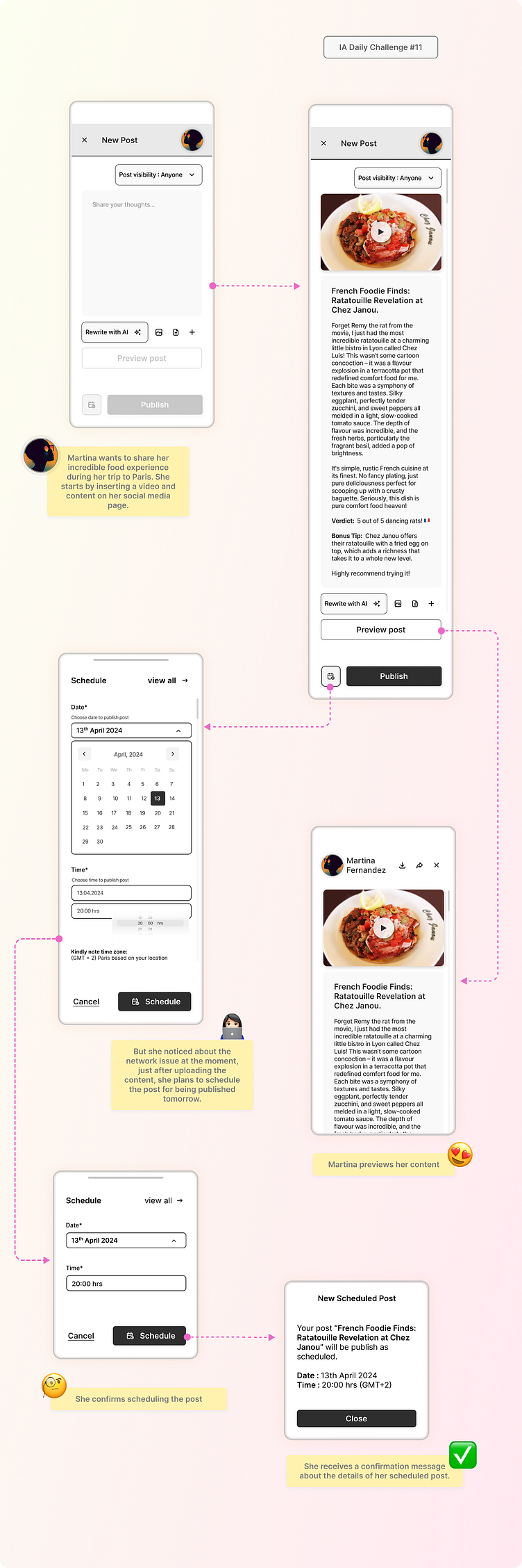
✅Day 11: Scheduling a Social Media post. Day 11 was all about crafting a user-friendly experience for drafting and scheduling social media posts. Think clear text formatting options, easy scheduling tools - clear calendars, easy time selection, and making sure your witty caption doesn't get lost in a maze of buttons ;) a layout that makes it easy to see what you're posting before it goes live!
✅Day 12: Train Ticket TriumphPlanning a trip? Struggling with booking train tickets online? Day 12 threw me into the world of booking train tickets online. The focus? Creating a smooth and efficient process for users to browse routes, select seats, and buy tickets without getting stressed; think intuitive filtering, clear pricing information, and a smooth checkout process.
✅Day 13: Hail a Taxi with Ease. Day 13 put me in the passenger seat, focusing on designing a user-friendly app for booking taxi rides. The challenge was to make it quick and simple to find a ride, specify your location, and track the car's arrival – all in a few taps. This meant figuring out how to easily set pickup and drop-off locations, track arrival time, and choose the right type of ride for your needs.
✅Day 14: Bug Slayer - Reporting System Errors Ever encountered a confusing error message? Day 14 involved designing a clear and helpful system for reporting system errors. Of course, Day 14 was a bit different. The goal was to make it easy for users to report issues clearly, provide helpful information, and track the progress of their report, making it easy to explain the issue, attach screenshots, and get assistance.
✅Day 15: Pizza Perfection - The Customized Order Challenge We all love pizza, but customizing an order online can be a minefield! Day 15 tasked me with designing a user-friendly experience for customizing a pizza order online. Think clear topping options, easy customization, and a seamless checkout process to satisfy your cravings with no hassle.
It's been a fun week exploring the IA of everyday tasks, and it's made me realize how good design can make even the most mundane things more enjoyable.What about you? Ever come across a social media scheduling tool or a taxi app that left you pulling your hair out? Share your experiences in the comments below!I'm thrilled to share my work at the academy here: https://hype4.academy/profile/bhawana-kumari-rajesh
They may not be perfect, but am open to suggestions and ready to learn from the experts here :)
Hope you like it !
Feel free to give your suggestions for improvement.
And press [ L ] if you ❤️ it! :-)
I am available for new UI design projects!
Drop a mail at Bhawana.CreativeStudio@gmail.com


