Information Architecture #2 to #5 - 30 days challenge
#2 - #5 : Information Architecture - 30 days challenge @Hype4Academy
Hello all 👋🏻,
UX/UI peeps!
After conquering the first one, I'm diving deeper and tackling some real-world scenarios this week (days 2-5).
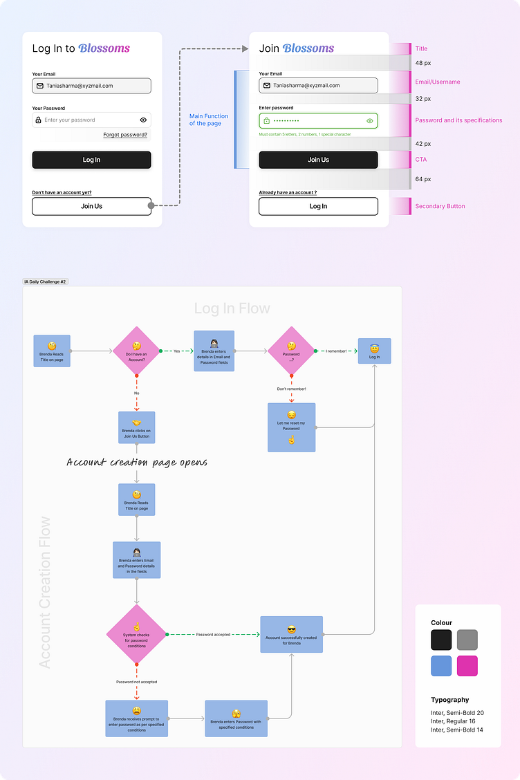
✅Day 2: Making Registration Forms Less Painful..This day was all about making those pesky registration forms user-friendly. Think clear labels, logical flow, that's easy to navigate, and (dare I say) even enjoyable to complete! Trying to make sure users don't get tripped up by confusing fields. Any tips on making forms fantastic?
✅Day 3: Sorting and Filtering Like a Champ! We've all been there - browsing a website with filters that look like another language. Day 3 was about creating sort and filter lists that are intuitive and user-friendly. Think clear categories, easy-to-find options, and helping users find what they need quickly and easily.
✅Day 4: Helping Users Remember Their Passwords (Hopefully )Let's be honest, forgetting your password happens to the best of us. Day 4 focused on designing a "Forgot Password" flow that's clear, secure, and guides users through the reset process smoothly. Think simple instructions, easy steps, and keeping users informed on their progress. Any ideas on making password resets less frustrating? Let me know in the comments!
✅Day 5: Navigational Panel Power Up!A website's navigation panel is like a roadmap - it helps users find their way around. Day 5 was about crafting a navigation panel that's well-organized, easy on the eyes, and accessible to everyone. Think clear categories, logical hierarchy, a consistent design, and helps users find their way around effortlessly. It's all about organization and making things easy to find!
The Biggest Takeaways:
This week really emphasized the importance of user-centered design in IA. The more you understand how users think and behave, the better you can create an interface that's intuitive and delightful to use. It's all about keeping things clear, simple, and user-focused! The IA should make life easier for people using the website, not harder.
I'm thrilled to share my work at the academy here: https://hype4.academy/profile/bhawana-kumari-rajesh .
They may not be perfect, but am open to suggestions and ready to learn from the experts here :)
Hope you like it !
Feel free to give your suggestions for improvement.
And press [ L ] if you ❤️ it! :-)
I am available for new UI design projects!
Drop a mail at Bhawana.CreativeStudio@gmail.com


