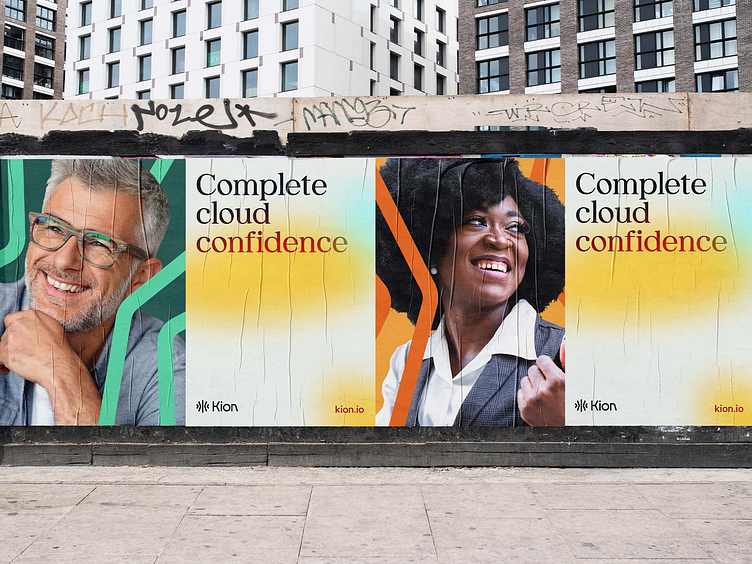
Kion Visual Identity
Kion's system is made up of five elements: color, typography, pattern, the clouds, and photography. When viewed collectively, these elements provide the ultimate sense of agency and agility. We created a system to define how elements should be combined, and when.
The visual language exhibits movement while instilling transparency. A mix between crisp geometrics and subtle organic shapes, clean typography, and a clear grid structure, this is a mature, energized evolution. The darker, richer colors evoke trustworthiness. Layers add depth, communicating a sense of transparency, trust, and openness.
Click here to view the full Kion case study.
---
Looking for a brand agency? We would love to hear from you.
Email us: hello@focuslab.agency
More by Focus Lab + Odi View profile
Like
