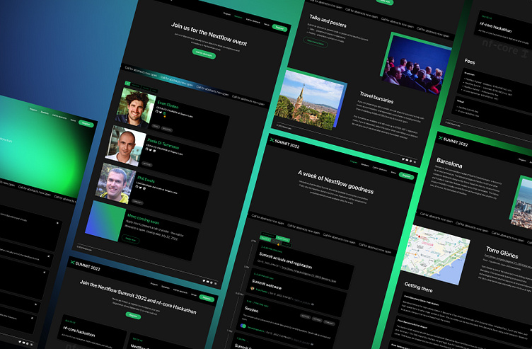
Web site design: Nextflow Summit
I was tasked with creating the website for a major event within a tight three-week deadline. One of the biggest challenges was the requirement to reuse components from an older website, while still delivering a fresh, modern design.
(The second challenge was in the same time create a visual identity for this event - [View project])
To tackle this efficiently, I set up a streamlined process with two colleagues—one focused on event planning and content creation, and the other on front-end development. This close collaboration allowed us to seamlessly integrate the old components with a new visual identity, ensuring a polished, cohesive brand and a fully functional website.
Despite the constraints, I delivered a high-quality, on-time solution, proving that collaboration and speed can thrive even within limitations.
Process
Step 1: Crafting the Information Architecture (IA) – Shaping Navigation and Content
I kicked off by designing the website's navigation, drawing inspiration from an extensive analysis of successful event websites. This step was pivotal, as it laid the foundation for the site's entire content and structure. By creating a user-friendly navigation, I ensured that the content would be seamlessly organized, guiding both the design process and the planning of the website's release.
Step 2: Component and Layout Audit – Balancing Reuse and Innovation
With the requirement to reuse components from an older website while delivering a fresh, modern design, a deep understanding of the existing elements was essential. To streamline the process, I conducted a thorough component and layout audit, ensuring compatibility and cohesion. During this phase, I also created a comprehensive UI kit in Figma.
Here’s an example of the original website from which components were repurposed:
Step 3: Visual Identity – Merging Brands and Innovating Design
The challenge of uniting the well-established Nextflow product brand with Seqera Labs' company branding, while also crafting a unique visual identity, was particularly tough given the tight timeline. This was achieved through the consistent use of shared colors and typography, with the strategic addition of black to the primary palette. This color shift was a long-standing wish of the community and naturally became a key element of the brand.
To introduce innovation, I incorporated animation as the focal symbol, creating a dynamic visual that could evolve with each season of events, ensuring freshness without disrupting brand consistency for years to come.
Step 4: Website design
With all the key components in place, I moved on to crafting the website. The development process was carefully structured into three releases, allowing for steady progress.
The first release, a Minimum Viable Product (MVP), was successfully launched on time, marking a crucial milestone in the project. This approach ensured that the website evolved efficiently while meeting deadlines.
ABOUT:
Date: 2022
Environment: Agile
My role: web and graphic design, workshops facilitation, team coordination and planning, content management
Summit website: Nextflow Summit 2022
kh.uxer@gmail.com
get in touch


