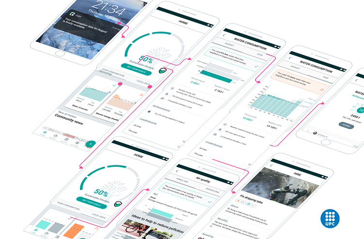
UX/UI of mobile app: OURS
In 2020, I completed my master’s thesis in Advanced design at Polytechnic University of Catalunya (UPC) by designing a mobile app focused on encouraging sustainable lifestyle behaviours using behavioral design principles.
Drawing on my specialization in behavioral studies and psychology, I integrated design methods and strategies to create features that effectively promoted eco-friendly habits. Using the Google design system "Material Design", I ensured the app was both intuitive and visually cohesive.
This project deepened my understanding of how behavioural design methods can elevate design process, and I successfully defended my thesis with a top score.
The entire process is thoroughly detailed and clearly explained in the thesis.
Step 1: Research on sustainable lifestyles and behaviours
Before diving into product design, I embarked on an extensive academic journey to explore sustainable lifestyles and the behavioural changes that drive them. My research aimed to uncover the underlying motivations, barriers, and effective strategies for fostering sustainable practices among individuals and communities.
Step2: Mindmapping
While developing a design from initial concept to high-fidelity mockups, a crucial phase involved building a cohesive concept by integrating a diverse range of ideas and topics.
Step 3: Product vision and mission
To create a clear and focused framework for the application, I established its vision, mission, and goals, outlining the product's core logic and methodology. This foundational work set the stage for a strategic approach to development.
Step 4: Feature definitions
Leveraging extensive academic research on sustainable lifestyles, I identified several key themes and brainstormed corresponding features. Each feature was carefully defined to ensure its relevance and usability within a mobile context.
Step 5: Information architecture
The concept was then translated into a well-structured information architecture and intuitive navigation for the mobile application.
Step 6: UX designed combined with behavioural change design
I began by pinpointing and categorizing the desired behaviours, which laid the groundwork for a comprehensive behavioural plan. Utilizing the Story Framing technique, I meticulously identified the triggers, actions, rewards and investments associated with each behaviour. This in-depth analysis allowed me to select targeted strategies and tactics tailored to each behavior, effectively shaping the user flows. Instead of solely focusing on the user's goals during the design process, I concentrated on a set of criteria and conditions that would not only help achieve those goals once but also encourage the development of habitual behaviors.
Step 7: Visual identity
The branding goal was to effectively communicate product values and foster a strong mental connection between users and the product. I began by employing archetype methodology to establish a foundational understanding. Next, I identified key brand values, which guided the selection of names, colours, and iconography.
Step 8: UI design
For the user interface, I implemented the Material Design system to ensure a consistent and intuitive experience as well as speed and efficiency when design the product.


