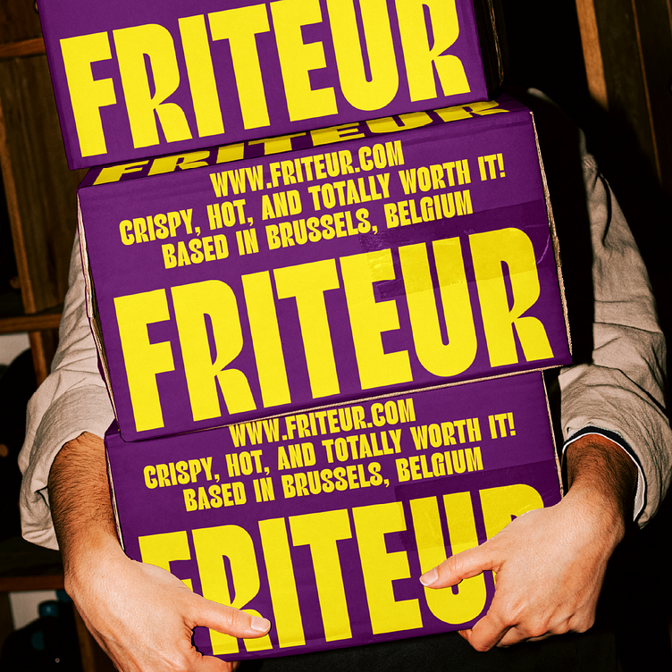
FRITEUR | Belgian Fries | Branding | Product Design
Hi Guys!
The design for FRITEUR is all about being bold and unforgettable. With dark purple as the dominant color, the brand’s look is rich, modern, and full of attitude. Paired with bright yellow accents, the color scheme creates a high-energy vibe that instantly grabs attention, making it perfect for a fun and memorable Belgian fries experience.
Remember to keep it in mind ❤️!
For more info look for me on social 👇🏻
Figma: https://www.figma.com/@juliDesignCo
Behance: https://www.behance.net/60d5d0ce
Instagram: https://www.instagram.com/julidesignco
More by Yuliia Hrabynska View profile
Like


