YORKNEW - City Services Landing Page
Overview
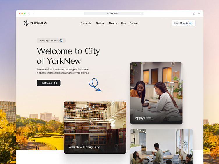
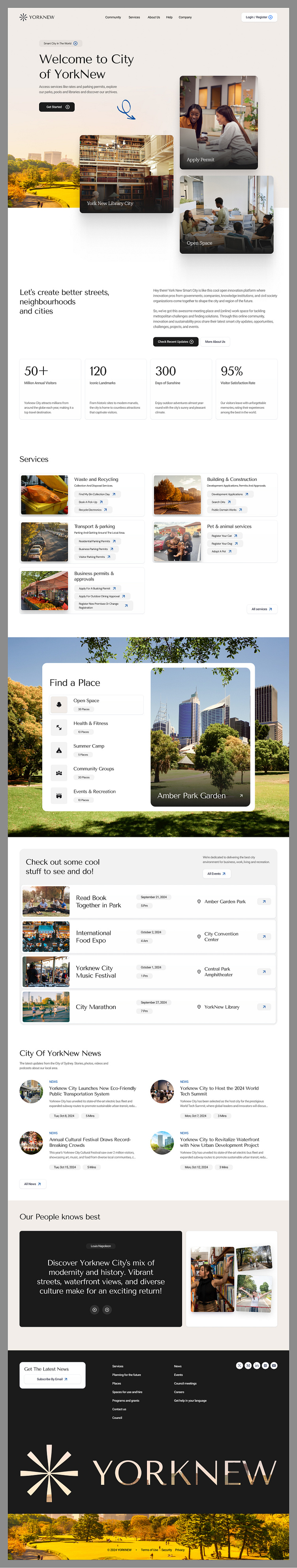
The City of YorkNew's website design aims to provide users with easy access to municipal services, events, and essential information about the city. The interface is welcoming, modern, and focused on creating a seamless user experience for both residents and visitors.
Goals of the UI
Accessibility: Ensure residents and visitors can quickly access services such as permits, transportation, and recreational activities.
User-Friendly Navigation: Simplify navigation to various city resources, such as event information and city services.
Civic Engagement: Encourage participation in community events and initiatives.
Informative Design: Offer clear information about services, news, and places in YorkNew in a visually appealing manner.
Design Analysis
Color Scheme:
The website utilizes neutral and calming tones, like beige and light gray, combined with vivid images to create a balanced and welcoming atmosphere.
The accent colors on the CTA buttons (such as green and blue) stand out, guiding the user’s attention toward important actions.
Typography:
A modern and readable font style is used throughout the site. The larger font size in the headers provides a clean contrast with the body text.
There is a clear hierarchy in text, with headlines, subheadings, and body text well-spaced, making information easier to scan.
Imagery:
High-quality imagery is used to showcase key parts of the city (such as the library, open spaces, and residents enjoying services). These images reflect the city’s vibrant culture and community-focused approach.
Layout and Responsiveness:
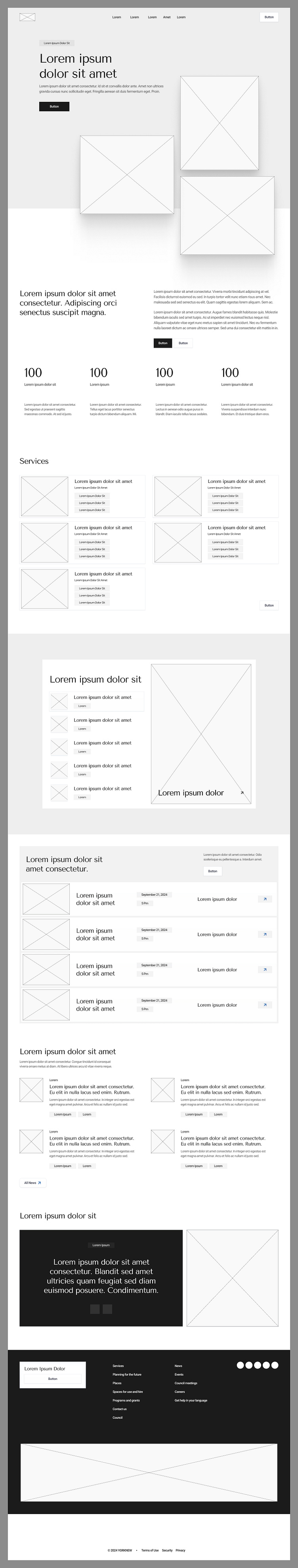
The grid layout is structured to present information in a digestible and visual format. The use of white space ensures the design doesn’t feel crowded.
The design appears responsive, with components such as the services and places search tool indicating functionality for both desktop and mobile views.
User Experience (UX)
Ease of Navigation:
The UI design places frequently accessed services and options in easily identifiable places, minimizing user effort. The presence of large CTAs directs users toward the main actions quickly.
Engagement:
Events and news sections encourage users to interact with the city’s cultural offerings. The design emphasizes community involvement, which adds a personal connection to the user’s experience.
Accessibility:
The design appears accessible, with clear typography, sufficient color contrast, and a simple navigation structure, catering to a diverse group of users, including those with visual impairments.
Functional Search:
The "Find a Place" search tool is a major feature that enhances usability, allowing users to locate parks, gyms, and other amenities with ease.
Wireframe
Hi-Fi
Let's collaborate with us
🛍️ Download our Premium UI Kit on
Follow our pages and join the journey
Instagram | LinkedIn | Behance
📨 inquiry@caraka.io | 🌐 caraka.io