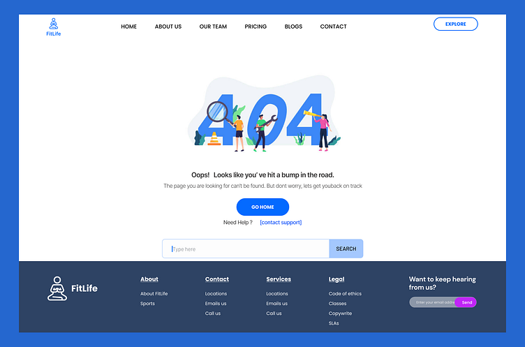
DailyUI #008 PAGE 404 SCREEN
Prompt: 404 Page Design Design a 404 page - that's not boring! Does it suit the brand's style? Is it user-friendly? It might sound mundane, but not everything can be flashy or glamorous. Every day millions of people will be landing on 404 pages. You have an opportunity to help them in a way that's useful and aesthetically pleasing. (It's up to you!)For my design, I designed a responsive (mobile and web) error 404 design for FitLife fitness app with clear messages that helps to redirect users ! Essentially, the whole idea of this design is to ensures that even when users encounter a 404 error, their experience remains positive and aligned with brand <FitLife>This design has User-Friendly Features such as; 1. Clear Navigation= Buttons and links to direct users back to main areas of the app….”the home page)2. Search Functionality= which ideally help users find what they were looking for quickly.3. Visually Appealing design= Consistent branding with a clean, engaging design. Your feedback will greatly be appreciated


