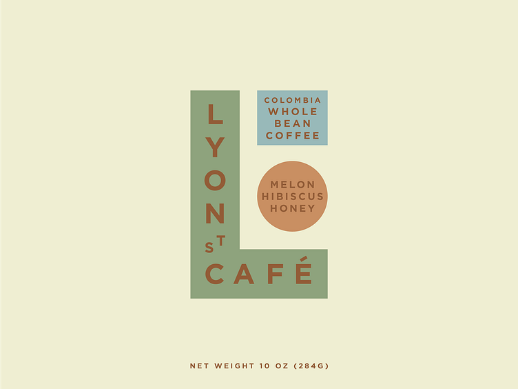
Lyon Street Rebrand/Packaging Concept
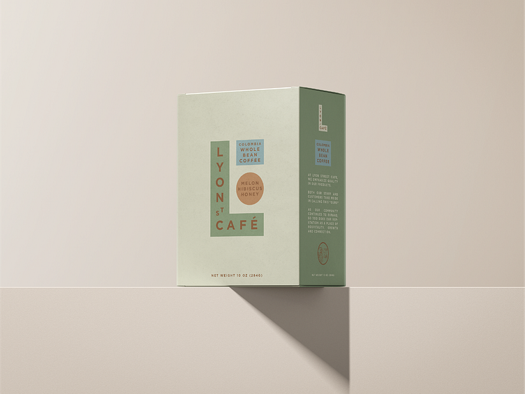
What started as a packaging concept for a cafe, quickly turned into a rebranding concept. Though unfortunately, I don't think this will ever see the light of day.
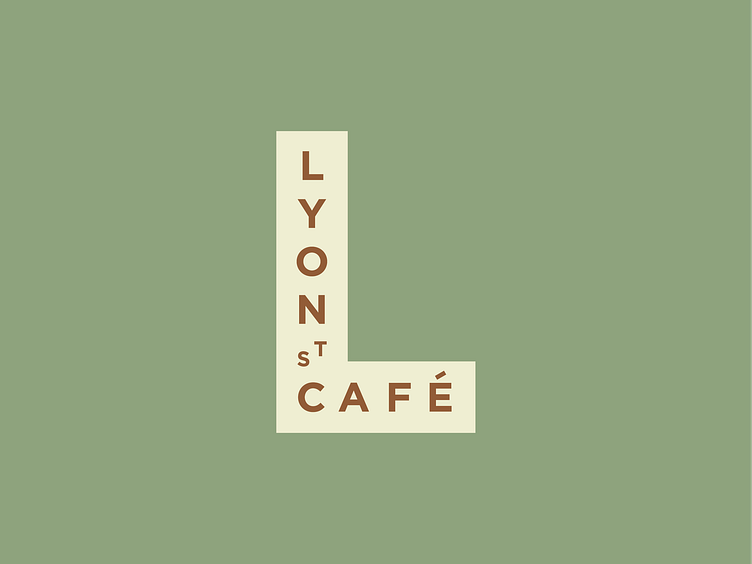
I kind of stumbled into the L shape, while trying to balance the vertical type of "Lyon" and "Cafe". Obviously, I was running into the problem of what to do with "St" or "Street" until a lightbulb switched and the L shape came to life.
It's a simple mark, but one I really like. I think it captures part of the vibe of the business, along with the vibe of that part of town. In addition, I think it would've made a really fun, recognizable 3D sign.