Daily UI #017 - Purchase Receipt
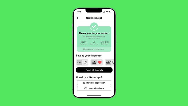
For today's #100DaysOfUI challenge, I worked on an Order Receipt screen for an e-commerce app. The design is clean and minimalist, focusing on delivering essential order details in a clear, user-friendly way. Here's what I included:
A confirmation message with a prominent checkmark to reassure the user that their order was successful.
Key details like total amount, number of items ordered, and estimated delivery date are easily visible at a glance.
A CO2 neutral delivery badge, promoting eco-friendly practices.
An interactive Save to your favourites section with brand logos and like buttons to encourage users to engage further.
Call-to-action buttons for users to rate the app or leave feedback, making it easy to share their experience.
Feedback and suggestions are welcome! Let me know what you think 😊

