UX/UI design of desktop app: ProjectConfig
During this project, I led the design efforts from concept through to development, transforming an initial idea into a fully realized product. Leveraging an established design system, I was able to concentrate on the core aspects of Information Architecture (IA) and UX design. I collaborated closely with the sales team—the app’s primary users—conducting in-depth research to ensure the design aligned seamlessly with their workflow and requirements.
About the app
The app serves as a centralized product encyclopedia for the company, consolidating data from multiple sources into a single, always up-to-date platform. This unified resource streamlines access to accurate product information, supporting the sales team with reliable, real-time data.
Step 1: Analysis, Workshops, User Research, and Ideation
Connecting teams and databases was the key to success of this product. Hence, before designing a single screen, I facilitated several ideation and workshop sessions with cross-functional teams to ensure a deep understanding of the current tools and workflows in use.
These workshops helped uncover critical pain points and opportunities for improvement. I employed various mapping techniques to visualize and interpret the complex interactions between teams and their tools,
Step 2: Prioritization and Sprint Planning
As the design lead, I collaborated closely with the product manager and development lead to plan and prioritize the sprints. Together, we broke down the project into manageable phases. In moments where decision-making became challenging, I facilitated workshops to align the team and push the project forward.
Step 2: Designing, Prototyping and testing
During each sprint, I focused on designing one or more key features. Collaborating closely with developers, internal experts and data scientists, we brainstormed and refined concepts to ensure every idea was feasible and aligned with technical capabilities. This dynamic, cross-functional collaboration, grounded in mutual respect, kept the project on course and allowed us to meet our goals.
To ensure the product was both practical and user-friendly, I also conducted several prototype testing with real users. These sessions offered invaluable insights, enabling rapid iterations and refining the application into a more intuitive and effective tool.
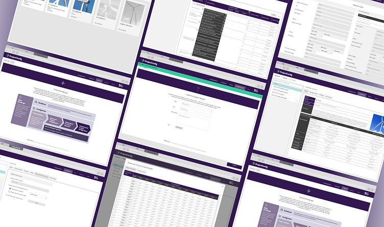
Example of some of the key designs and prototype:
Step 4: Documenting and Building the Design System
In fast-paced environments, staying organized is key to scaling design effectively. To keep up with the pace, I built a design system as I developed product designs. Every component, from buttons to complex UI patterns, was carefully designed, validated with front-end developers, and fully documented for seamless reuse. This design system ensured consistency, speed, and collaboration, allowing the team to quickly iterate and launch new features without sacrificing quality. It also enabled me to focus on UX and usability.
Step 5: Organizing Design Files
I established a clear and transparent structure for organizing all design files, making it easy for anyone on the team to access, collaborate, or leave feedback. This file organization became a cornerstone of our workflow, ensuring that team members could quickly find what they needed without confusion.
ABOUT:
Date: 2021
Environment: Agile with remote scrum team (devs based in India)
Design team: design lead (me), 2 product designers, 1 design intern, 2 UX researchers
My role: design, workshop facilitation, product planning, team management
Company: Siemens Gamesa
kh.uxer@gmail.com
get in touch


