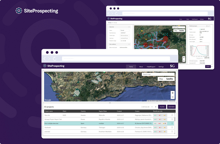
UX/UI design of desktop: SiteProspecting
The journey began with a groundbreaking idea: to revolutionize how site engineers evaluate the suitability of locations for wind farms, transforming a process that typically takes weeks into a matter of just minutes. Through a meticulous approach encompassing Information Architecture (IA), UX/UI design, and in-depth research, I developed a comprehensive end-to-end design for a desktop application.
Leveraging the company's existing design system as a foundation, I enhanced it throughout the project to ensure superior usability and a seamless user experience. Our team thrived in a highly collaborative remote agile environment, where creativity and communication flourished.
As the Design Lead and the sole UX/UI expert, I took on a pivotal role in shaping the design vision. My focus was always on the user, guiding the team to prioritize their needs while coordinating closely with cross-functional members to bring the application to life. This collaborative spirit was crucial in turning our innovative concept into a practical, user-friendly tool that empowers site engineers in their critical work.
Process
Step 1: Workshops, Analysis, User Research, Ideation – with a Focus on Information Architecture
The project kicked off with a deep dive into understanding both the business objectives and user needs. I conducted thorough workshops, analyzed all available materials, and reviewed the prior work done by the project manager. By leading user research, sketching initial ideas, and brainstorming content, I was able to shape a clear direction for the project.
The result? A well-structured Information Architecture for the MVP, serving as the backbone for the product design and ensuring a user-centered approach from the very start.
Step 2: Prioritization and Sprint Planning
As the design lead, I collaborated closely with the product manager and development lead to plan and prioritize the sprints. Together, we broke down the project into manageable phases. In moments where decision-making became challenging, I facilitated workshops to align the team and push the project forward.
Step 3: Designing
In each sprint, I tackled the design of one or more features using Design Thinking methods and UX research. By working in fast-paced cycles of ideation, prototyping, and testing, I ensured that we met tight deadlines, as the development team relied on me to deliver end-to-end designs. I frequently collaborated with developers and data scientists, ideating together to ensure all concepts were feasible. This collaborative and dynamic process, built on mutual respect, allowed us to stay on track and deliver the project according to plan.
Example of some of the key designs:
Step 4: Documenting and Building the Design System
In fast-paced environments, staying organized is key to scaling design effectively. To keep up with the pace, I built a design system as I developed product designs. Every component, from buttons to complex UI patterns, was carefully designed, validated with front-end developers, and fully documented for seamless reuse. This design system ensured consistency, speed, and collaboration, allowing the team to quickly iterate and launch new features without sacrificing quality. It also enabled me to focus on UX and usability.
Step 5: Organizing Design Files
I established a clear and transparent structure for organizing all design files, making it easy for anyone on the team to access, collaborate, or leave feedback. This file organization became a cornerstone of our workflow, ensuring that team members could quickly find what they needed without confusion.
Step 6: Developing a Product Communication Strategy and assets
In large corporate environments, information overload can be a real challenge, and adopting new tools or products often faces resistance. To tackle this, I developed a comprehensive communication strategy that ensured clarity and engagement. This included crafting cohesive user journey and designing emails, prevention template, product documentation, and promotional materials. By delivering clear messaging, I helped drive product adoption and ensured that everyone stayed informed. Moreover this strategy and assets are reusable for other products in the ecosystem.
Example of one of the template I created, onboarding email:
ABOUT:
Privacy restriction: under NDA
Date: 2020-2021, 3 releases (each up to 10 sprints)
Environment: Agile with remote scrum team (dev team based in India)
Design team: design lead (me), 1 design intern
My role: design, research, workshop facilitation, product planning
Company: Siemens Gamesa
kh.uxer@gmail.com
get in touch


