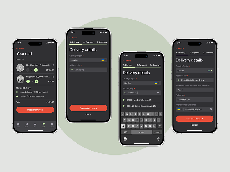
Check out / cart / delivery
Hi everyone! Here's a checkout flow for my design concept for an iOS mobile app focused on investing into precious metals. It's spit into three steps (you can see the bar above) to make the process clear and understandable. Many users add items to cart, but never check out, because the process is so complicated and there are so many fields to fill in. This approach is more friendly and minimalistic.
Second step required to select a payment method or quickly add a new card, if necessary. You can save new info and continue the checkout safely.
And the third and final step is order summary, where users check whether or not they've filled in everything correctly, see all the prices (products + delivery or any additional costs) and confirm their order.
I hope this concept turned out functional and friendly-looking as well, because financial apps don’t have to be intimidating or boring. Investing is possible with any budget and available for everyone.
Thank you for watching!
Contact me: rinabezruk@gmail.com


