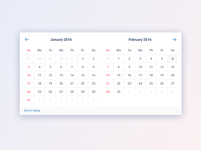
Date Picker
I personally like the bluish tone on the dates: legible and not too sharp. What do you think?
Thanks to @Dwinawan Hariwijaya for the gradient :P
date-picker.sketch
400 KB
More by Yehezkiel Gulo View profile
Like

