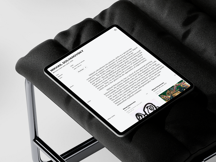
Product card
Artwork info page
You can view the full case study at the following link: Behance project
The block with images of the artwork is fixed on the left while scrolling and occupies a significant portion of the space, allowing users to immerse themselves more deeply in the work and its details. On the right side of the image, all the necessary information about the painting and the artist is displayed.If the artwork is available for purchase, users can click the "Purchase" button to proceed to the application form. If the painting has already been sold, the label "Sold" will appear instead of the button. For works not related to sales, only essential information will be displayed without any buttons or labels.It's important to note the ability to add the artwork to favorites. This allows users to save works of interest and return to them later for further exploration or purchase. Additionally, users can also add the artists to their favorites, making it easier to find and engage with their creations.
How do you feel about the result? I would appreciate any feedback you can give✨
Don't forget to press "❤️" if you enjoy it :)
------------------------------------
📨 Get in touch: Telegram, Whatsapp, rofu.asya@gmail.com

