Exhibition Info
Exhibition Info page
You can view the full case study at the following link: Behance project
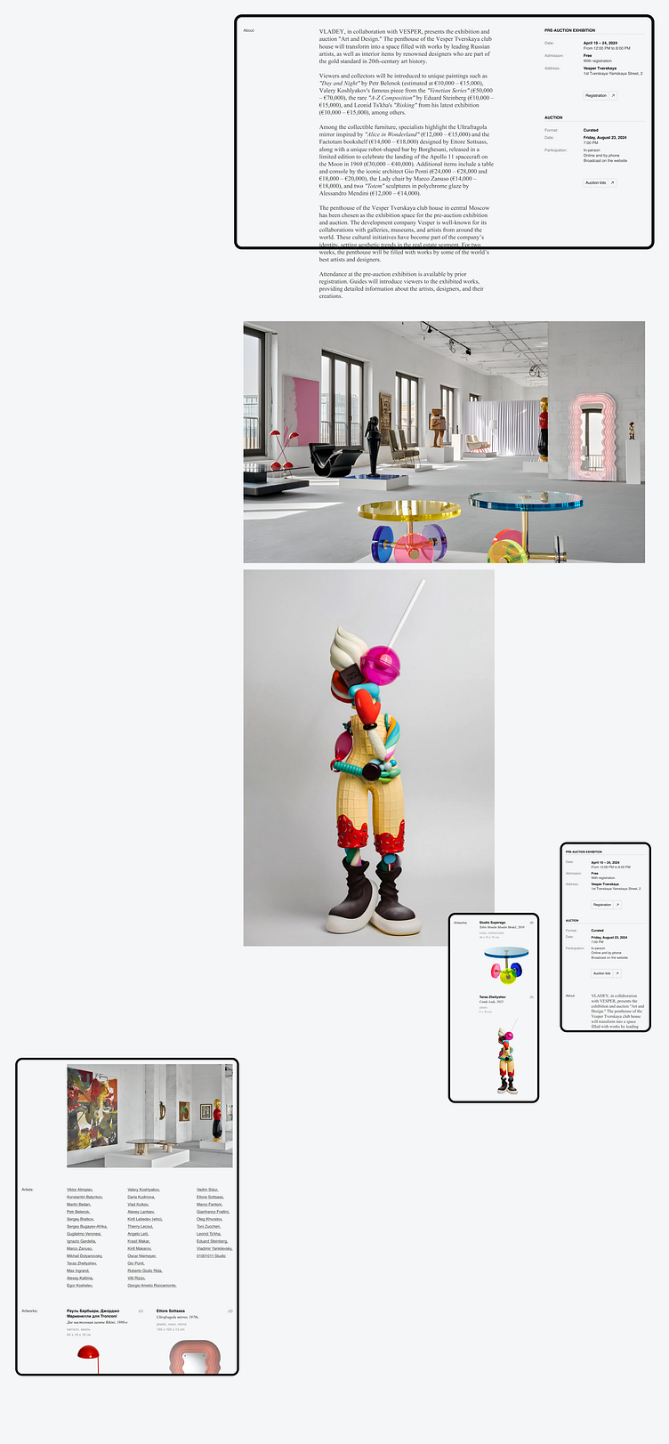
When designing the exhibition information page, it was important to create a flexible, easy-to-customize, and attractive structure that would inspire users to visit the event. All blocks on the page are easily adaptable: they can be added, removed, and modified without compromising the overall design concept. For example, if the exhibition is a pre-auction one, in addition to the main information about it, it is important to highlight the details of the auction. This can be done by placing the relevant content directly under the exhibition information, which is located on the right. Additionally, some exhibitions may include videos — they can be easily integrated into the gallery, where, instead of a classic carousel, images are organized in a continuous vertical stream. This approach immerses the visitor deeper into the atmosphere of the exhibition and art in general as they scroll.
How do you feel about the result? I would appreciate any feedback you can give✨
Don't forget to press "❤️" if you enjoy it :)
------------------------------------
📨 Get in touch: Telegram, Whatsapp, rofu.asya@gmail.com


