Company rebranding: Seqera
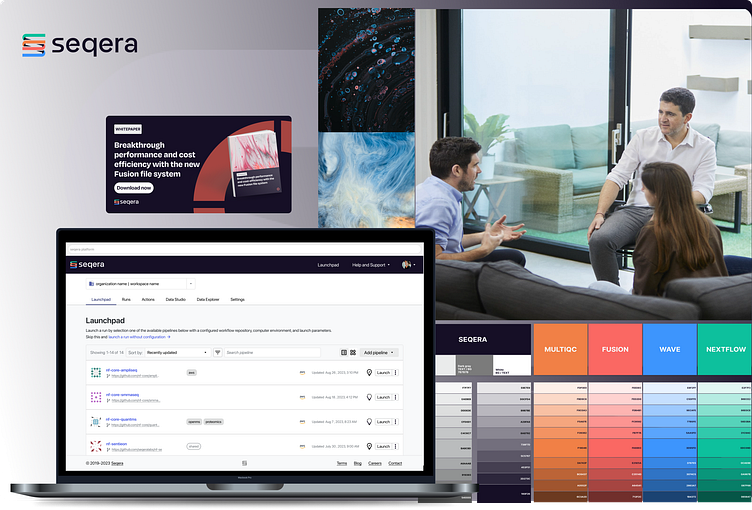
The rebranding process initially started with an agency but their work did not satisfy the stakeholders and it was thrown away. Right after I took the lead and using collaborative approach that included stakeholders and several specialized designers (e.g. logo designer) resulted in a new bold visual identity for the company and all related digital and physical touch-points.
As the result I updated whole design system, UI of products, coordinated website redesign and all marketing assets.
Process
Step 1: In-Depth Understanding of the Company and Product Offerings
An in-depth analysis of the company, coupled with engagement with key stakeholders, provided valuable insights into its vision and future plans, while a review of current product offerings and exploration of potential services highlighted growth opportunities. The evaluation of existing communication and marketing strategies helped identify areas for improvement, and a thorough analysis of market trends and competitors ensured a unique market positioning.
Additionally, I mapped out the brand architecture to clarify how the various products and services align with the overall brand identity, laying the groundwork for a cohesive and strategic rebrand.
Step 2: Defining key brand values
After conducting thorough analysis and engaging in discussions with key stakeholders, we identified and defined the core brand values (aligned with company values) that will serve as the foundation of our new visual identity. These values reflect the essence of the brand and guided us in next steps:
Boldness: The brand exudes confidence and make a strong visual impact.
Creativity: The visual identity conveys a sense of innovation with human touch.
Minimalism: While incorporating abstract shapes or bold colors, the brand maintains a clean and minimalist using minimal amount of components .
Modernity: The visual identity feels contemporary and up-to-date.
Step 3: Design Proposals
The next step involved working closely with a graphic designer. Each of us developed two distinct proposals, with each representing a unique visual identity and art direction for the company. These concepts were then presented to stakeholders in a workshop, where I facilitated an interactive session to gather valuable feedback, align the creative direction with stakeholder expectations, and identify key elements that would shape the final visual identity moving forward.
One of the early proposals I prepared emerged as the strongest candidate:
Step 4: Ideation and Collaborative Leadership
The ideation phase proved to be the most demanding part of the redesign process. I led this effort in a highly collaborative manner, working closely with key stakeholders, while the graphic designer focused on refining the designs to perfection. Together, we addressed each challenge, iterating on solutions until we secured full approval for the proposed concepts.
While elements like the color palette, typography, UI, and art direction were among the easier aspects of the redesign, the illustrations and logos proved to be much more challenging. For these, we hired external specialized designers, whom I led throughout the process. I also regularly presented their work to stakeholders to ensure alignment with our vision and goals.
The primary Seqera company logo is a sophisticated design that cleverly combines the shape of a DNA strand with a stylized "S," symbolizing innovation in life sciences and technology. The logo's vibrant colors represent Seqera's diverse range of products, adding a layer of dynamism and connection across the brand. In contrast, the product logos are more minimalist, following a consistent pattern that features four distinct quarters of a cycle. This cohesive design reinforces the unity of the product line while maintaining a clean, streamlined aesthetic that is both recognizable and functional.
Two of Seqera's most recognizable branding elements are its bold, oversized patterns, derived directly from the product logos, and striking macro imagery that ties the brand to its biotech roots. The oversized patterns create a strong visual identity, instantly associating the design with the company's product line, while the macro images highlight the intricate, microscopic world of biotechnology. Together, these elements reinforce Seqera's focus on innovation and the life sciences, merging cutting-edge technology with the organic precision of nature.
Step 5: Rebrand of the application UI
I did the complete rebrand of the application UI, including updating the components in the design system. I ensured seamless integration by collaborating closely with the front-end team, providing all necessary design assets and support to ensure seamless transition. As a bonus I was also able to add a few small usability improvements.
Step 6: Coordination of website design
When an external designer joined the team to help design the website, I took the lead in ensuring the newly established branding guidelines were consistently followed. I coordinated the designer's work and presentations to key stakeholders, while also reviewing new components to ensure they met our internal standards before being integrated into the design system.
Step 7: Creating Templates for Marketing and Communication
Designing the assets was one task, but turning them into easy-to-use templates for non-design team members was another. I carefully selected the right tools and formats to ensure ease of use while maintaining brand consistency. This ensured that even non-designers could confidently use the templates without deviating from the established branding.
Step 8: Brand guidelines
I created and presented the brand guidelines and rules to ensure all employees were familiar with the new brand.
ABOUT:
Date: 2023
Design team: design lead (me), 1 graphic designer, 1 logo designer, 1 web designer
My role: design, research, analysis, workshop facilitation, planning, team management
Company: Seqera
kh.uxer@gmail.com
get in touch


