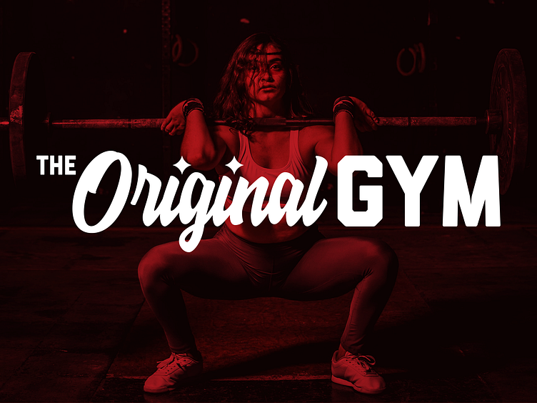
The Original Gym Logo
These are some unused branding concepts for a new gym. The owner is from Pittsburgh and chose the name “The Original Gym” as a homage to The Original Hot Dog Shop—a former Pittsburgh staple that shut its doors in 2020.
The owner chose a black/gray/red color palette, and wanted the logo to look similar to the O’s typographical logo—“Original” in a script font and “Gym” in a bolder font.
I added some hypocycloids to dot the i’s in “Original” to incorporate some Pittsburgh Steel into the logo as well.
Unfortunately, the owner decided to go with another designer before I had a chance to present these options, but I thought they were worth a share.
More by Mike Asper View profile
Like


