Sync2Clarity Branding Project
Excited to share my latest branding project for Sync2Clarity, a company specializing in bookkeeping, payroll, and remote staffing services. 🎨
Logo Concept
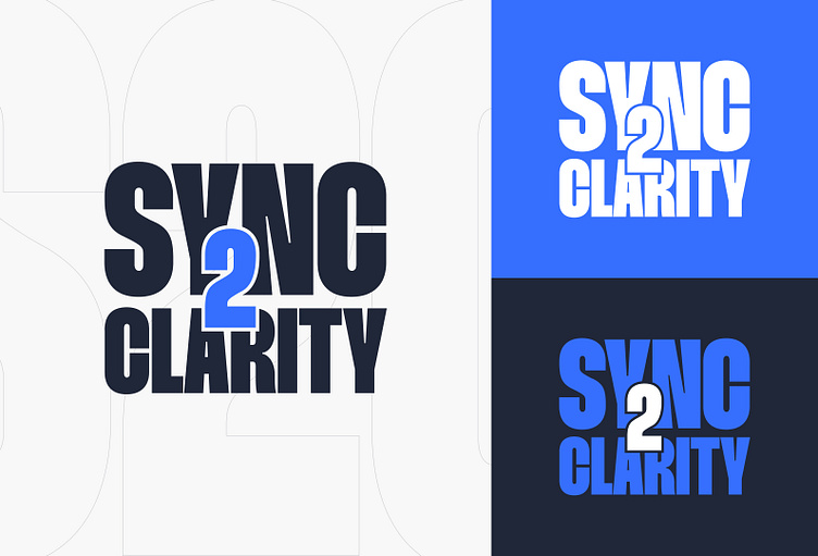
The design centers around clarity and connection. The bold typography represents strength and precision, while the bright blue "2" highlights the link between data (SYNC) and insights (CLARITY). The clean lines and structured form reflect the company’s commitment to organizing complex financial data into actionable insights.
Color Palette
Deep Navy: Signifies trust and reliability.
Bright Blue: Represents clarity, innovation, and focus.
Key Focus
Precision in design reflects accuracy in financial services.
Clarity ensures communication is straightforward and impactful.
Trust is built through a strong, stable visual identity.
Connection is symbolized by the central "2", bridging data and insights for clients.
Feel free to leave your feedback! 💬✨
