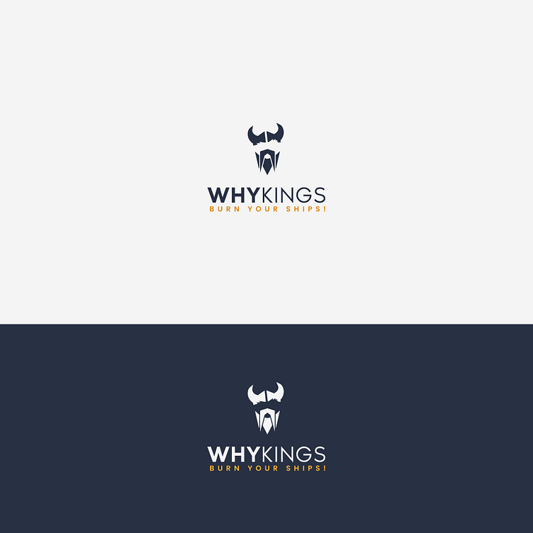
Whykings Logo
Day 36/365. Today's post is a logo design for a mock brand, "Whykings". The slight humor in the name is evident. The design itself is meant to be minimalist but still have some character to it, hence why the helmet is slightly tilted, to not be as imposing, and you can see that one eyebrow is slightly raised, nodding to the question "why?" found in the brand's name.
More by Bogdan Vezeteu View profile
Like
